Do you interpret your t-SNE and UMAP visualization correctly?
This post is based on a recent paper published in Nature Communications. Great work by my PhD student Zhexuan Liu!
A routine for visualizing high-dimensional data
A basic task in data science is visualization of high-dimensional data: given \(n\) data points in high dimensions, how can we get a quick sense of the structure of the data? Apart from principal component analysis which projects data linearly to a subspace, it has become quite common to use t-SNE or UMAP, which reduce data dimensionality nonlinearly to 2D or 3D for visualization.
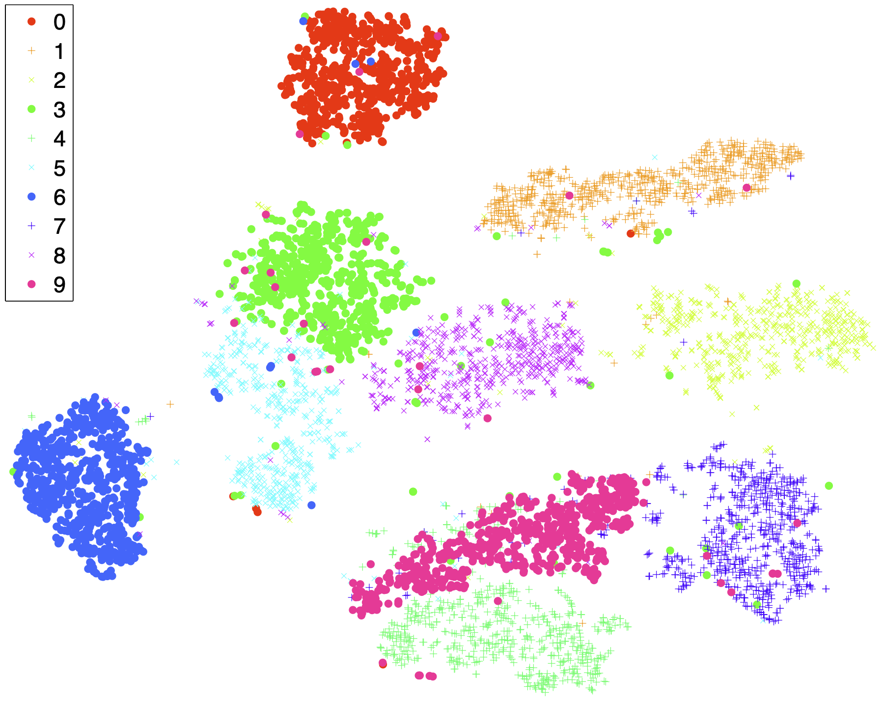
Let me take the following example from the original t-SNE paper. The MNIST dataset consists of images of handwritten digits 0 through 9, each at a resolution of 28×28 pixels. The t-SNE visualization suggests cluster structure for the 10 classes.
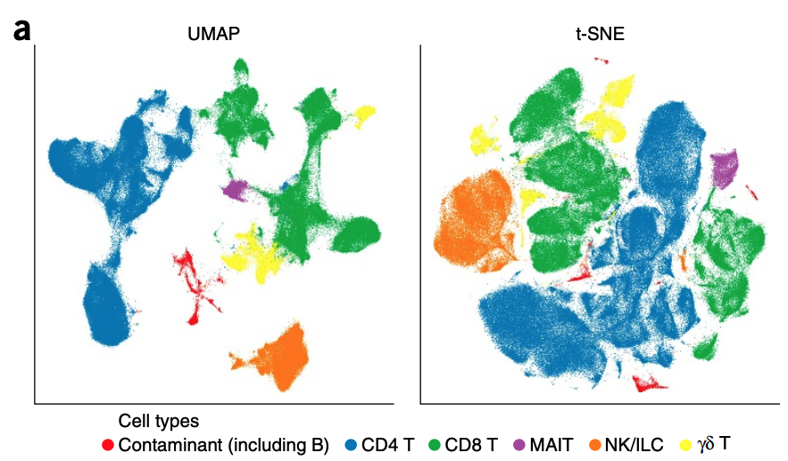
A closely related visualization method is UMAP, which is quite popular in single-cell data analysis, where we want to visualize measurements (high-dimensional points) of a collection of cells in a 2D plane. The following example is taken from a paper that studies cell types from UMAP visualization.
Interpretability crisis
It looks amazing, you may say. What’s going wrong in the visualization? Well, t-SNE and UMAP map high-dimensional points nonlinearly to 2D or 3D by design, but the algorithms underlying the visualization methods are highly complicated. A natural question is how faithful t-SNE and UMAP are as nonlinear dimensionality reduction methods.
- Q1: Does large distance between points imply high dissimilarity?
- Q2: Does clear seperation between clusters imply distinctness of grouping?
Perhaps unsurprisingly, many researchers have examined distortion effects of t-SNE and UMAP and gave a negative answer to Q1. Yet, a continuous map should at least preserve the topological structure of input data—in particular, non-overlapping sets should be still non-overlapping after mapping. Some of the distortion-related issues are addressed in Rong Ma’s prior papers [1, 2] and analyzed in [3].
Human eyes often take for granted the continuity of embedding maps (which is quite reasonable), but an affirmative answer to Q2 is unfounded. Nature reports a controversy centering on the interpretation of a UMAP visulization of genetic data. The following figure which I took from the paper in question appears to show clear separation between different racial groups.
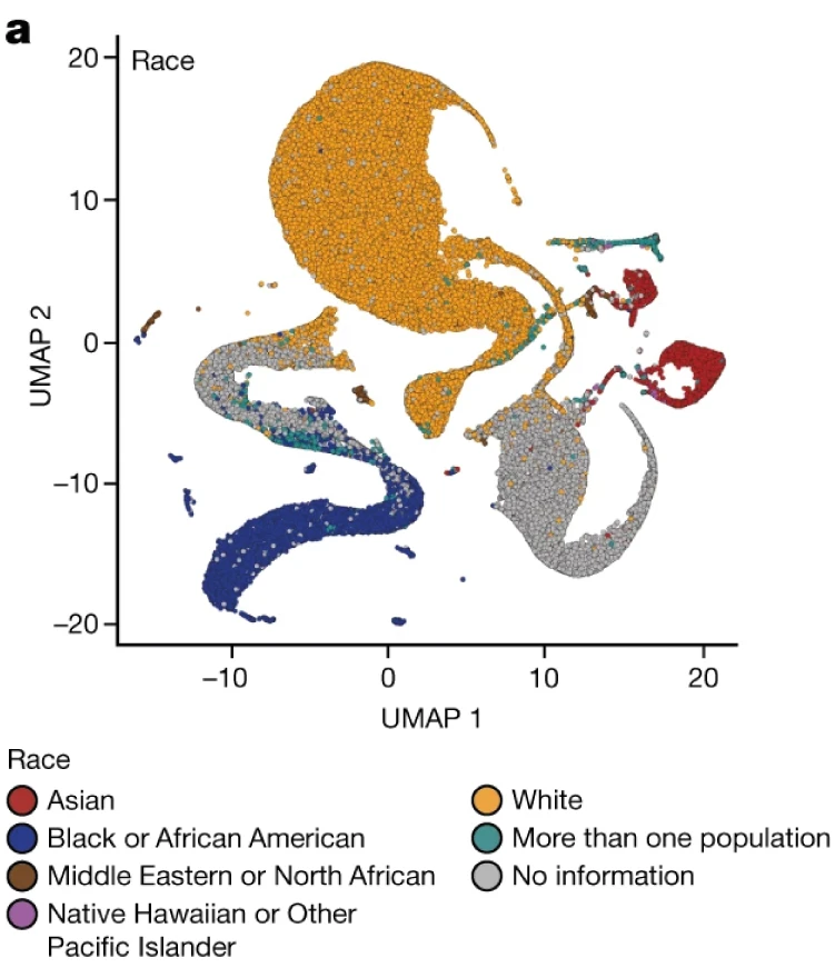
Is such distinctness a misleading artifact created by UMAP?
Are t-SNE & UMAP manifold learning methods?
Tracing the root of this interpretational confusion, I found an official tutorial webpage on manifold learning, which includes t-SNE as one of the manifold learning methods.
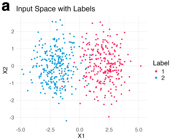
Let me explain why this interpretation is wrong. Let’s simulate a few hundreds points from a mixture of Gaussian distributions in 2D.
Then, we run t-SNE and get two typical visualization plots (which one we get depends on the hyperparameters).
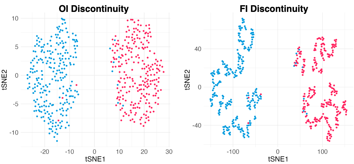
Clearly, there are two types of discontinuity patterns—the one on the left is global, while the one on the right is local. We can see how these discontinuities may lead to unfaithful interpretations.
- Left: Overconfidence-inducing (OI) discontinuity promotes distinctness of the two overlapping Gaussian distributions
- Right: Fracture-inducing (FI) discontinuity creates many spurious sub-clusters inside each Gaussian component.
Leave-one-out map reveals intrinsic discontinuities
How can we detect the discontinuities in t-SNE and UMAP visualization? To do this, we need to understand how t-SNE and UMAP work. Both methods receive high-dimensional input data \(\boldsymbol{X} = (\boldsymbol{x}_1, \boldsymbol{x}_2, \ldots, \boldsymbol{x}_n)\) and return low-dimensional embedding points \(\boldsymbol{Y} = (\boldsymbol{y}_1, \boldsymbol{y}_2, \ldots, \boldsymbol{y}_n)\) by solving an optimization problem that looks like the following.
\[\begin{equation} \min_{\boldsymbol{y}_1, \ldots, \boldsymbol{y}_n \in \mathbb{R}^2} \sum_{1\le i<j\le n} \ell(w(\boldsymbol{y}_i, \boldsymbol{y}_j); v_{i,j}(\boldsymbol{X})) + Z(\boldsymbol{Y}). \end{equation}\]While I am not showing you details here, we can see that the first term captures pairwise interaction between each pair of input points. So every time I perturb a single point, we need to re-run t-SNE or UMAP again to get new embedding points. How annoying! This issue is one reason why the mechanism of t-SNE/UMAP is difficult to understand.
To make our lives easier, let’s assume that adding (or deleting/modifying) a single input point does not change embedding points significantly, which is used extensively in leave-ont-out (LOO) statistical analysis. If we make this LOO assumption (empirically verified in our paper), then we can define a map \(\boldsymbol{f}\) for any input point \(\boldsymbol{x}\):
\[\begin{equation} \boldsymbol{f}: \boldsymbol{x} \mapsto \mathrm{argmin}_{\boldsymbol{y}} L(\boldsymbol{y}; \boldsymbol{x}) \end{equation}\]where \(L\), which we call LOO-loss, is the partial loss (involving much fewer terms!) derived from the original loss in t-SNE or UMAP:
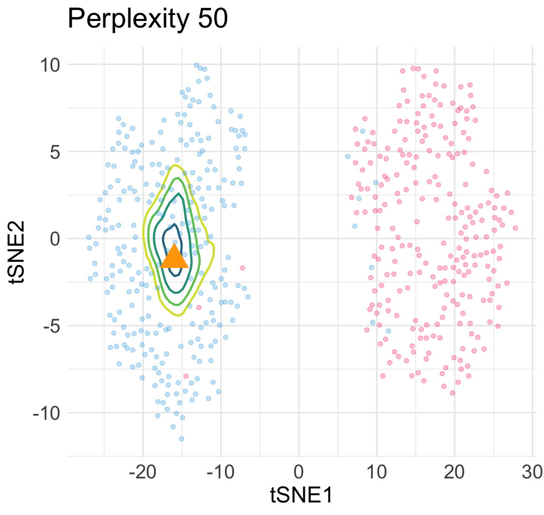
\[\begin{equation} L(\boldsymbol{y}; \boldsymbol{x}) = \sum_{1\le i \le n} \ell\Big(w(\boldsymbol{y}_i, \boldsymbol{y}); v_{i,n+1}\big(\begin{bmatrix}\boldsymbol{X} \\ \boldsymbol{x}^\top \end{bmatrix}\big)\Big) + Z\Big(\begin{bmatrix}\boldsymbol{Y} \\ \boldsymbol{y}^\top \end{bmatrix}\Big) \; . \end{equation}\]The loss landscape of \(L\) in terms of \(\boldsymbol{y}\) for a given input point \(\boldsymbol{x}\) gives us a lot of information about the quality of the embedded point. For example, in the previous simulation, when we add an interpolated input point between two Gaussian centers at a constant speed, the embedding point can jump from one cluster to the other cluster abruptly due to the saddle structure of the loss landscape. This means a large topological change of the embedding point \(\boldsymbol{y}\) under a small perturbation to \(\boldsymbol{x}\).
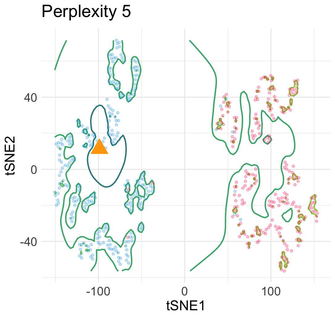
Similarly, under a different hyperparamter for t-SNE, the embeddings of interpolated input points reveal an uneven trajactory as we move the interpolated \(\boldsymbol{x}\) at an even speed. This suggests that embedding points are prone to getting trapped in many local minima—which is a cause of spurious sub-cluster we saw earlier!
Diagnosing unreliable embedding points
We’ve seen the potential existence of unreliable embedding points, such as intermixing points (mixture of two classes) getting “sucked” into two clusters. To combat this issue, we devised two types of diagnosis scores based on perturbing input points in our LOO-loss function. Calculation of both types of scores works as a wrapper without requiring ground-truth labels. Let me illustrate how the first type of diagnosis scores look like.
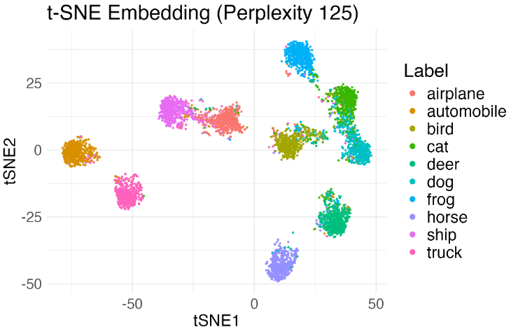
Let’s sample a few thousands images from CIFAR-10, and consider applying a standard neural network feature extract such as ResNet-18 to obtain image feature vectors. We run t-SNE and obtain the visualization as follows.
Since we are not sure if the separation between the clusters is an artifict, we run our algorithm and obtain diagnostic scores shown below.
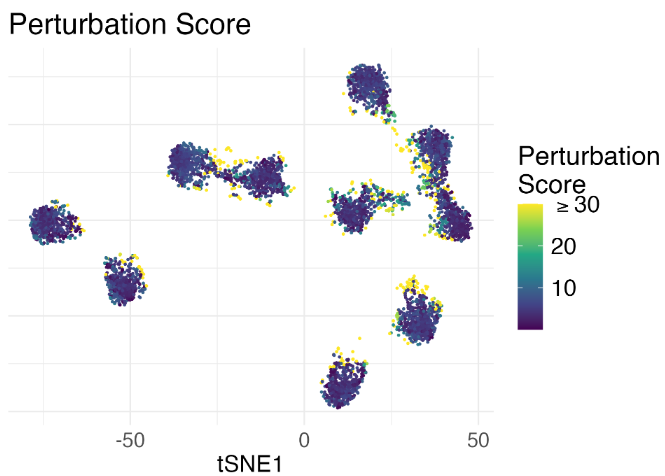
The yellow-ish points indicate that those embedding points are likely to be unreliable. Indeed, when we further examined the original images of those points, we found that they look quite ambiguous in terms of the class membership (namely highly uncertain to classify), yet t-SNE misleadingly embeds those image features to cluster boundaries. Without the diagnostic scores, we would probably have a reduced perception of uncertainty.
Concluding remarks: how to trust visualization?
Here are some lessons we’ve learned.
- Stop thinking of t-SNE and UMAP as manifold learning methods.
- As with other visualization tools, use and interpret t-SNE and UMAP with caution.
- Try different visualization tools or diagnosis if possible.
Interpreting visualization results inevitably involves some degree of subjectivity, and ultimately, it is up to the user to strike the right balance between expediency and rigor in scientific investigation.